

Monday, August 25, 2008
Sunday, August 24, 2008
Project 1: Self Portrait/Bio FINAL draft

And I'm done. Yippee-kae-ae!
By the way, the design is 12''x 18''
Saturday, August 23, 2008
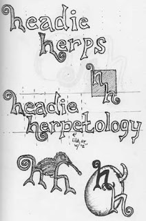
Layout Draft #3

Decided I didn't like the logos in the talk bubble...seems a bit confusing, perhaps? Plus, I am waaaay too goofy a guy not to put a phrase like "feed me"
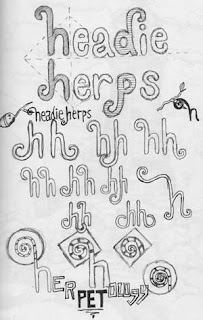
Layout Draft #2
Trying out a new idea. I thought it would be fitting to have the hand's "talk bubble" displaying my designs. I think it serves to bridge the two sides of the design better than the previous orientation of the bubble. Dropped the micron/ruler appearance from my design. I feel that maybe the top left is a bit distracting, but I do like the hands/"design by hand" design, just not sure yet if it's going to stay...I think that in order for my design to be cohesive, the logos need to remain in black, white, and grey as everything else is. Haven't decided which logo designs i am using yet so i just put "logo" text in the bubble to get an idea of the layout.


Wednesday, August 20, 2008
Self-Portrait

This is a rough, rough draft of what I'm going for at this point. The whole concept behind the piece is that I "let my hand do the talking" when it comes to my design process...basically, I achieve my ideas through strenuous sketching and enjoy producing hand-drawn illustrations/design most. Not too sure about the Micron/Ruler addition to the piece, thought it might be interesting to make the entire design appear as if it were done by hand and my actual drawing utensils lying across it somewhat. That being said, I believe something needs to be done with the background to achieve this effect, but I'm not quite sure what yet. The text in the word bubble will be hand-rendered, although the topics (Latin name, description, habitat, etc.) will be displayed in the form of a particular typeface (Garamond, Helvetica, etc.). And lastly, I think I need to lighten up my face a bit to fit better with the arm and because apparently (according to Mario) I look as thought I've just come out from working many years in a coal mine :)
Monday, August 18, 2008
Summer Sketching
To start things out, thought I'd throw up some of the sketch work I did while I traveled around all summer. Enjoi!
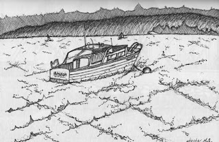
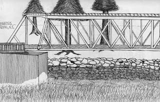
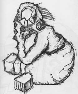
These are done free-handedly using either Micron or Staedtler pens. What I've noticed about ink pens lately...the Microns tend to produce a darker/more saturated black than do Staedtler. However, the type on the side of Microns (which tells the tip size) tends to ware away very quickly, and if you're like me and have eight different sizes...it can be quite annoying.
These first three are scenes I encountered in Nova Scotia, which is, as many people don't seem to know, a province of Canada that juts out from the North-Eastern coastline.

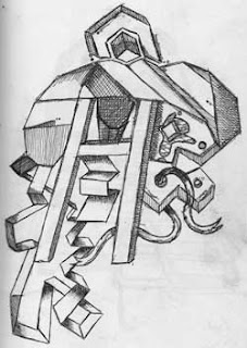
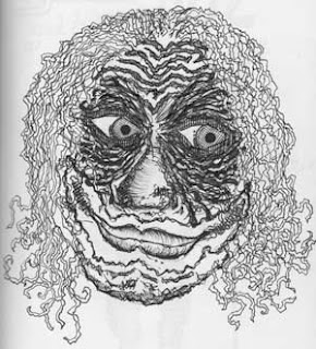
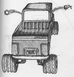
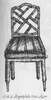
The rest are some goofy and some serious sketches done in different places for a variety of different reasons.


These are done free-handedly using either Micron or Staedtler pens. What I've noticed about ink pens lately...the Microns tend to produce a darker/more saturated black than do Staedtler. However, the type on the side of Microns (which tells the tip size) tends to ware away very quickly, and if you're like me and have eight different sizes...it can be quite annoying.
These first three are scenes I encountered in Nova Scotia, which is, as many people don't seem to know, a province of Canada that juts out from the North-Eastern coastline.


The rest are some goofy and some serious sketches done in different places for a variety of different reasons.


Subscribe to:
Posts (Atom)