Sooooo.............
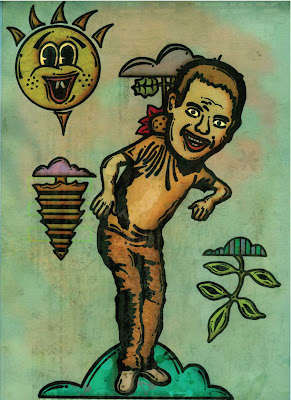
Following a tutorial in Computer Arts Projects magazine's November Issue, I attempted to create an illustration starting with an inked cartoonish drawing. After scanning my drawing in, I added color, texture, light and shadows in photoshop. The first image shows a few of the steps of my process. The second image is where I'm at so far. I don't feel as though this composition is done, but it's a start. I'll probably move on and work on another one because at this point, I'm sortof tired of staring at that goofy-faced dancer standing in the clouds...
Personal Observations:
1. Perhaps I could push the textures a bit further?
2. Varying the weights of the black lines of the base drawing might add beneficial contrast?
3. Add some more prominent typography?
4. Mix elements of realism into the composition?
5. Create a more direct narrative?
Any thoughts, suggestions, comments, advice?


No comments:
Post a Comment